
You may be surprised that this month’s blog post is not about public health, nor is it about epidemiology. It’s closely aligned though, in that I’d like to pay a bit of attention to lying with (objective) data.
Here in the UK we are gearing up for another election, with the most important theme seeming to be “how to out-UKIP the UKIP (UK Independence Party)”. This out-UKIPing is primarily done on the right site; as far as I have seen there is not a lot of passing on the left going on. Anyway, for those unfamiliar with current UK politics on the right side of the spectrum “we don’t like the EU and we don’t like immigrants” pretty much covers it. I don’t think this is limited to the UK, but it seems a fairly constant factor in right-of-centre politics everywhere (I have no idea, but suspect rightwing US politicians also dislike the EU…probably for being a socialist state or something along those lines). Being a foreigner in the UK I thought I’d have a look at the published data related to this topic, and it will come as no surprise that I found a very usable article in the Daily Mail (who don’t like immigration, or the EU, or David Milliband, or the Nick Clegg, or pretty much anything else…aside from Kim Kardashian). It’s a slightly older article, but it covers data up to 2010, which is enough for our purpose. The delightful article is entitled “Immigration soared by 20% last year – making a mockery of the Government pledge to bring it DOWN”, with the equally delightful quotes from Migration Watch UK: “These figures lay bare the legacy of the labour government” and (the DM again I think) “Number of Poles living in the UK has risen from 75,000 in 2003 to 532,000 at the end of last year”. Lovely…
Anyway, back to the story.
So I have taken the data used for the figure in the DM article and reproduced it in Excel (so that everybody can reproduce this, if they so wish). This is what it looks like:
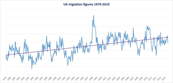
I have added the linear, purple trendline so that it is pretty obvious what has been going on. Immigration into the UK has been increasing…just as the Daily Mail and Migrationwatch keep telling us. With the elections coming up, and politicians forced to be seen to “do something”, this is serious cause for concern and is addressed regularly (for example today: link); the bottom line of these stories being that something needs to be done to reduce immigration!
Now have a closer look at the figure above, and more specifically at the last 15 years (roughly). Do you see an increase in immigration into the UK? Just to make it a bit clearer (and that’s why I transported it into Excel) I have extracted the data since 1996 for you. That looks like this:

As you can see from the figure, the purple trendline is horizontal. In fact there has been no increase for the last 15 years. Nothing at all….
In other words, just by choosing the time period a bit clever, it is possible to make the data show whatever you want. And you cannot be accused of cheating, because these are the real data.
The latter figure could be used to show that in fact immigration is not a problem at all. It has been steady for quite a while. Instead, you could point out to me, and if you are somewhere on the right side of the political spectrum that is what you would probably do, that although immigration has been stable for quite a while, if you look at the time trend since 1979 in fact immigration has been increasing. In fact, it is now about twice as high as 20 years ago! And you would be correct in pointing that out to me. Although there is a bit of plateau in recent years the immigration numbers are much higher than they were 2 decades ago, and that is a problem….

If you agree with that argument, and you find that the first figure correctly points to the need to curb immigration, I’d like to point out that these figures are in fact not the figures for the UK immigration.
Having said that, the Daily Mail article (link) does exist and the figure they use looks remarkably similar (even up to the 2-fold increase):

Do you see the plateau of immigration since about 2003 as well…

The figures I showed do exist though, and are in fact from something completely different.
I have started to read Naomi Klein’s new book “This Changes Everything” about climate change and capitalism (link). I thought her previous books (link 1; link 2; link 3) were quite good, so I also gave this one a go. I am not a climate scientist, so do not feel qualified to go too deep into the matter. However, that doesn’t seem to stop a lot of other people to voice an opinion on it. Anyway, I have only just started the book and in one of the first chapters there is a mention of the “Heartland Institute”, an American conservative and libertarian public policy think tank based in Chicago. Their website quotes The Economist stating ‘The Heartland Institute is “the world’s most prominent think tank promoting skepticism about man-made climate change.” ‘
They have a prominent graph,which is constructed by a Christopher Monckton, on their environmental page (link) . I did not know who that was, but as usual Wikipedia knows (link). Assuming this is the correct one, he is a journalist, conservative political advisor, and UKIP political candidate whose recent public speaking deals with social policy, the European Union (no surprise here) and on climate change. He is also a viscount, so that is quite cool. However, what he doesn’t seem to have is an education in climate science….like me, so we are equally well placed to discuss the topic.
The prominently placed figure on the Heartland website is the following:
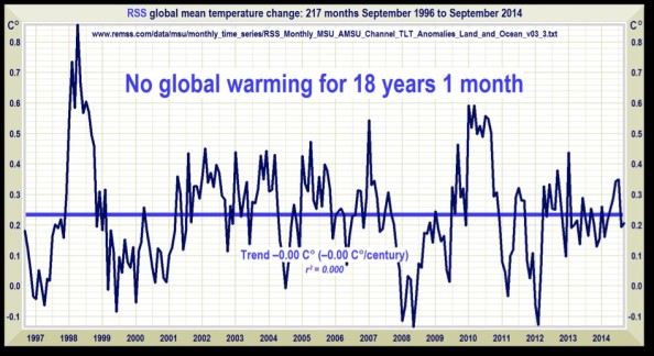
And that figure may ring a bell?! Indeed these are the data I used to illustrate the point about arbitrarily selecting recent data only and using that to make a point about immigration. Do you remember when you thought something like: “You cannot do that, immigration has been increasing since the 70s!”?
My point exactly!
This particular figure making the point of “No warming for 18 years 1 month” luckily does the source of the data. The link does not work, but with a bit of searching I found the relevant database (link) and reproduced the figure (just to make sure that we are dealing with the same thing, and so that you can do the same thing. If you so wish):

I’d say that this is pretty similar, or in fact exactly the same. I put the slightly more scientific equation on the chart, but it basically describes the same model. Temperature has not increased since 1996. Without going into too much detail about the methods, the graph essentially shows the anomalies in global temperature in the lower troposphere compared to some average (eg the “0”). If you are interested in the hows have a look at this page (link).
Now it is pretty clear to me, and I would imagine to most other people, that something like climate change should be looked at for a much longer timespan and that short-term variation can cloud things quite a lot (That’s why the Daily Mail, Migrationwatch, and maybe you, insisted we needed to look at a longer time period). Luckily the dataset included about 15 years more data; data that Mr Monckton and the Heartland Institute decided not to include. So I did that for them, and indeed you have seen that figure before:

That looks pretty much like an increase in global temperature, now doesn’t it? In analogy with the immigration argument above, I’d imagine this is as good a time as any to change your mind on climate change. And maybe be a bit worried about it? Basically like everyone with the appropriate training…
But nonetheless in recent years it has been slowing down; why is that? Again, I am not a climate scientist, so I don’t want to discuss that in too much detail. However, the climate seems a pretty complicated thing and we may not yet understand everything. Some explanations of why this mas happened have been put forward; things that instead of agreeing with the Heartland Institute should make you worried, at least a bit (for example: link 1, link 2, link 3). In analogy with the immigration argument as put forward by those who want to curb it: “for now we can still absorb the increase, but cracks are showing; at some point in the future the “sink is full”, we cant absorb anymore and things will go very wrong” (you may have heard this, or a similar argument in relation to, for example the NHS (link), and for those that agree with this line of thought, they should do something to curb climate change as well…

The point about this article was about lying with objective data. I lied to you when I gave you the wrong figures. But I have come clean about it in the same text, which not everyone does. The figure on the website of the Heartland Institute, the one created by Christopher Monckton, is the result of purposeful misrepresentation of the facts; in this case by arbitrarily choosing the range of data that was shown. An honest representation would have included all data from 1979 onwards; the data are available (in fact, the same argument could still be made. It just would not be such a strong case. For obvious reasons…). In fact it is more work to exclude the data than it is to include it…but I guess that wouldn’t convey the message the Institute wants to put out.
And this brings us back to public health. Public health also deals with policies, like climate change (in fact I would think the latter influences the former), and with policies come politics, and with politics come politicians, pressure groups and “think tanks” [brackets added on purpose….]. The charity Sense about Science runs a campaign called Ask for Evidence (link), and that is indeed what we should be doing. If data are used, see or ask where it comes from, and have a look at it yourself. Like I did here…
…it wasn’t too difficult to spot that something dodgy was going on…


 Sense about Science
October 17th, 2014 → 2:43 pm
[…] point used in the graph by Mr Monckton on the Heartland Institute website in my previous post (A tale of immigration) a bit more thought, and was quite curious about this “No Global Warming for 18 years 1 […]
LikeLike
December 10th, 2014 → 5:38 pm
[…] to the Heartland Institute’s website, about whom I wrote last month (link1, link2), the IEA website also has a figure on its website “Who’s killing the British pub?” […]
LikeLike